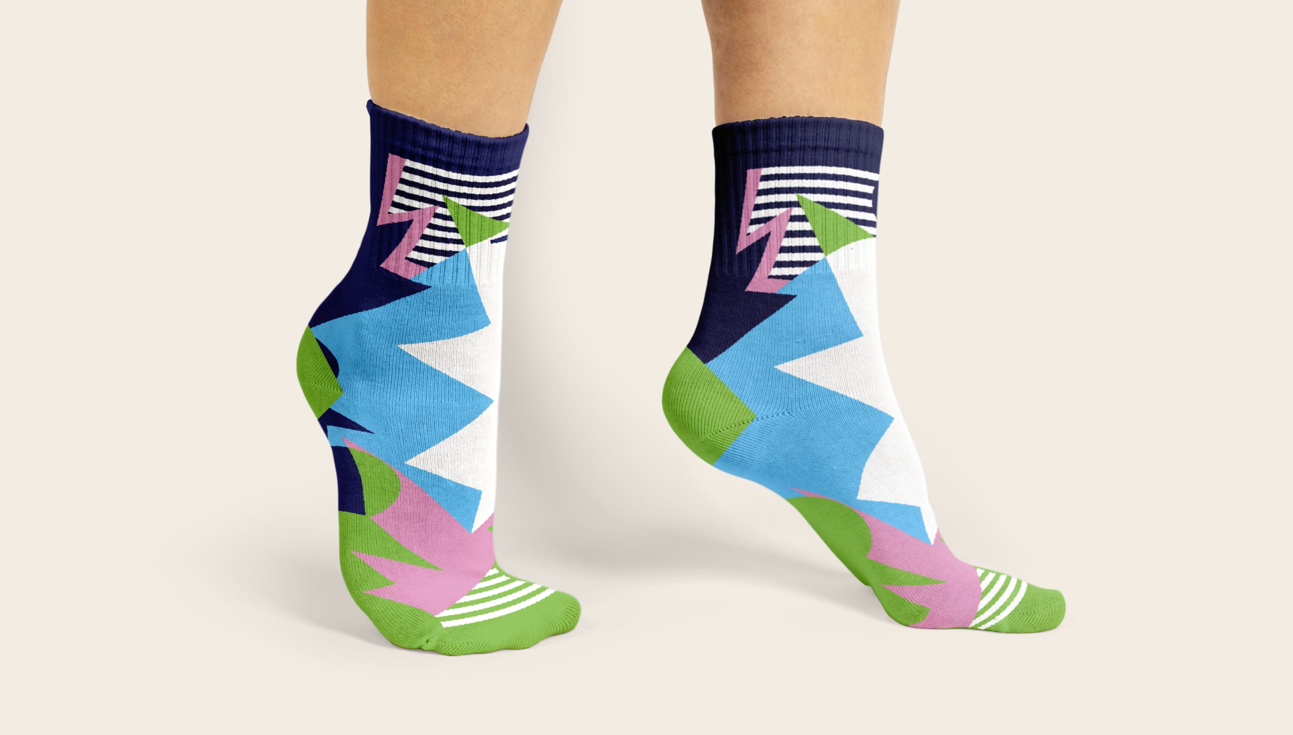
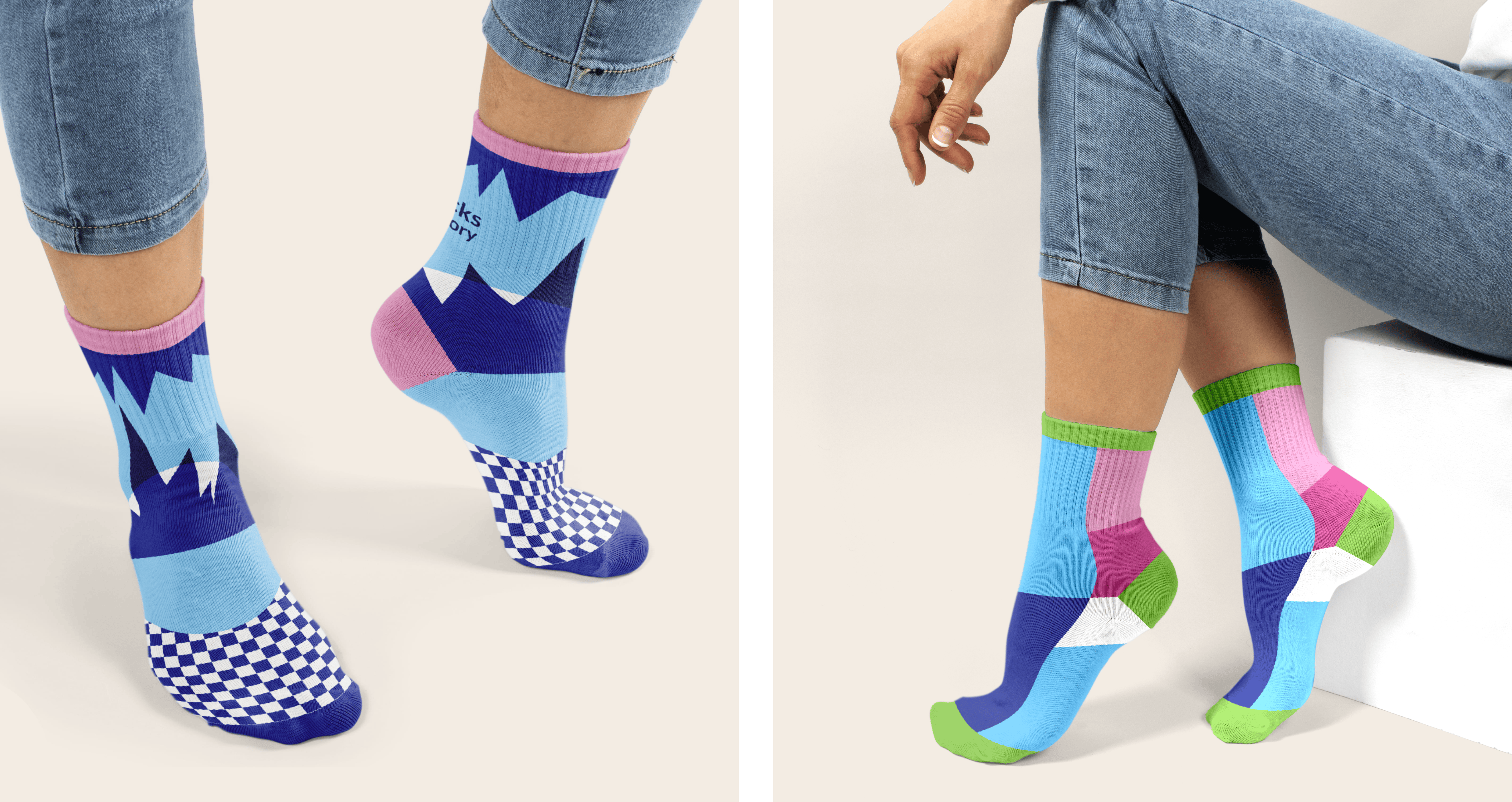
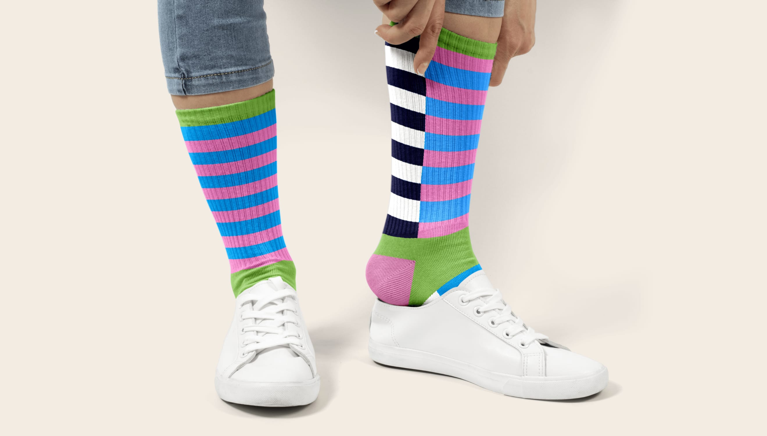
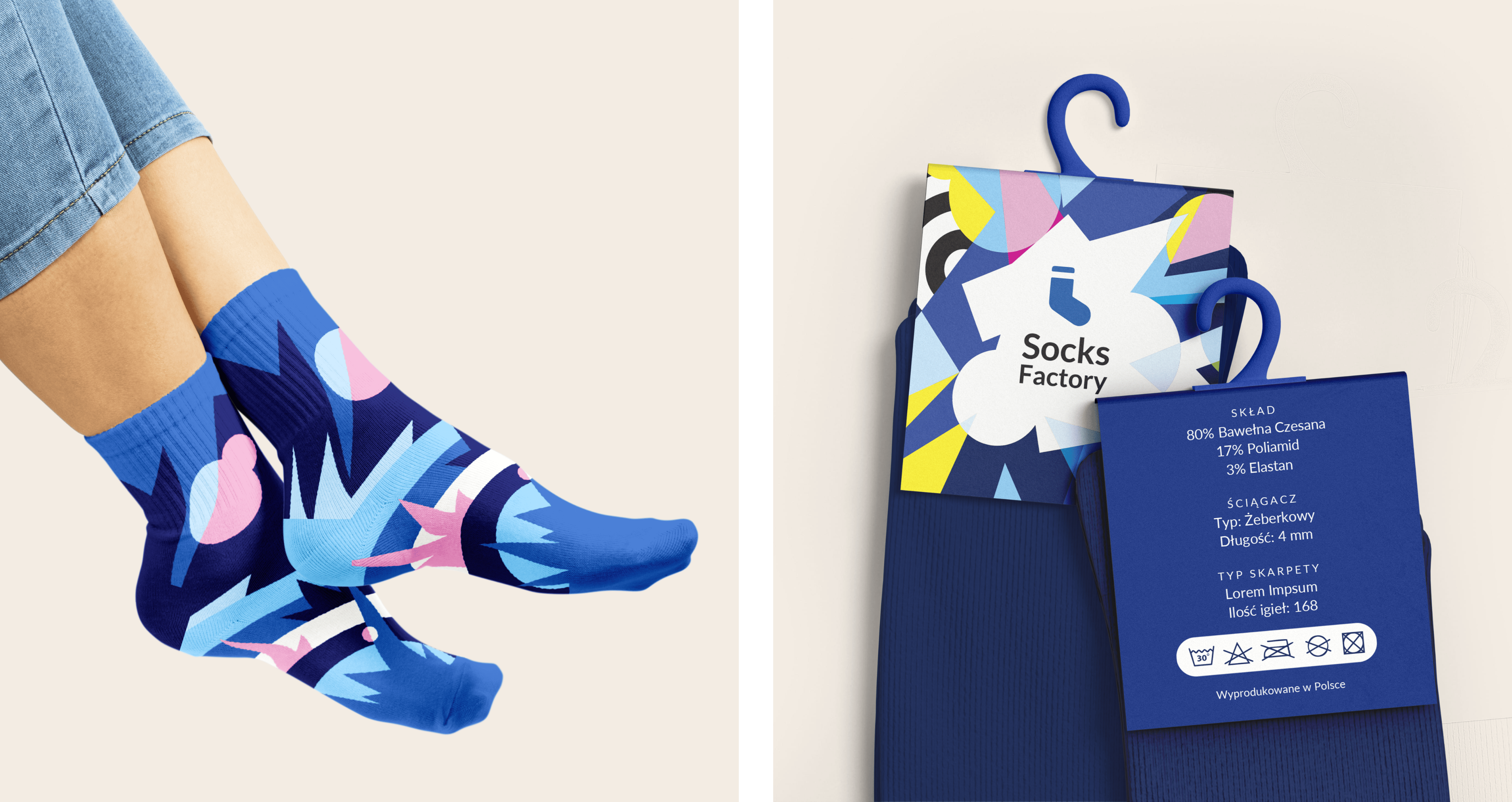
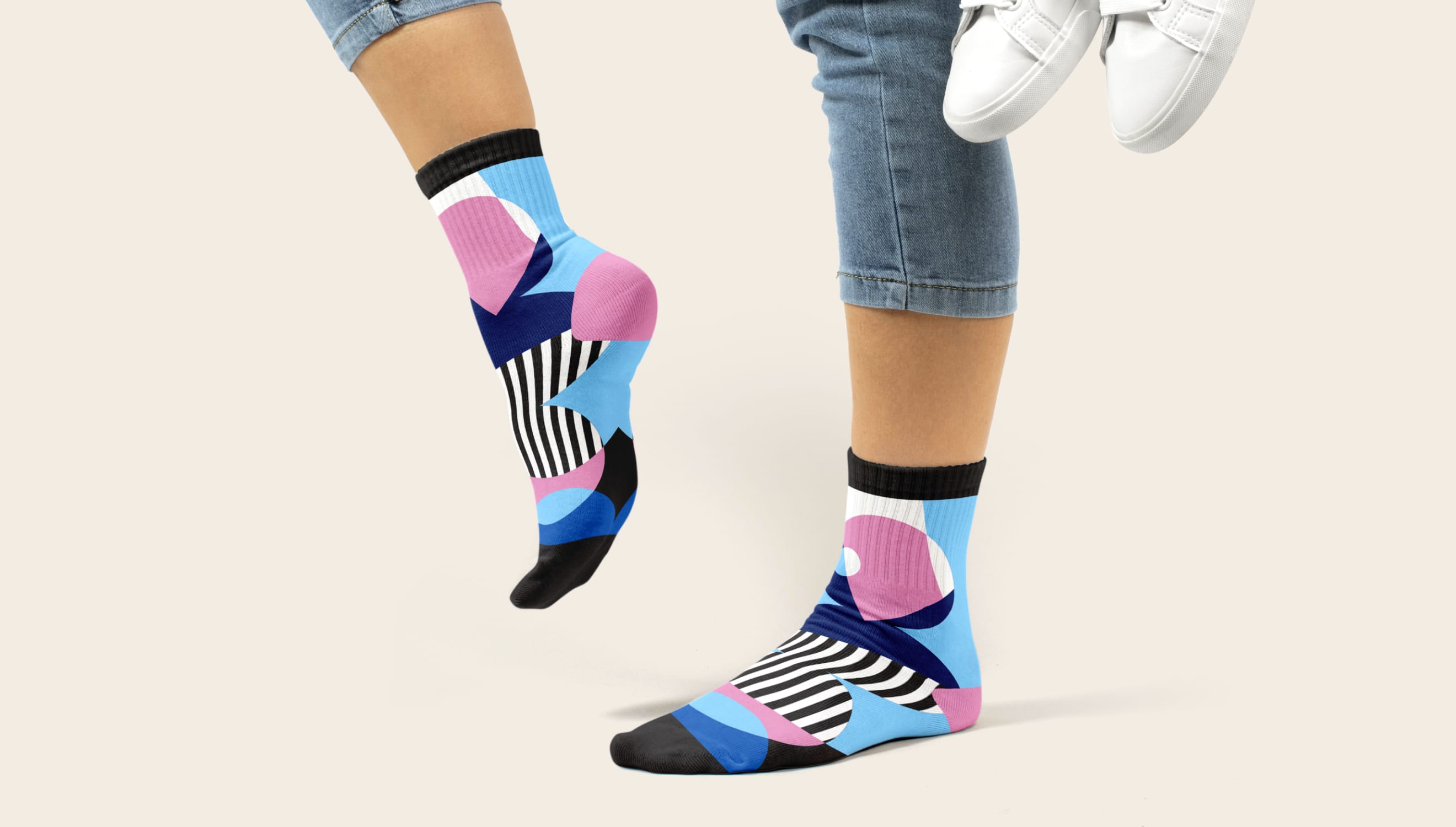
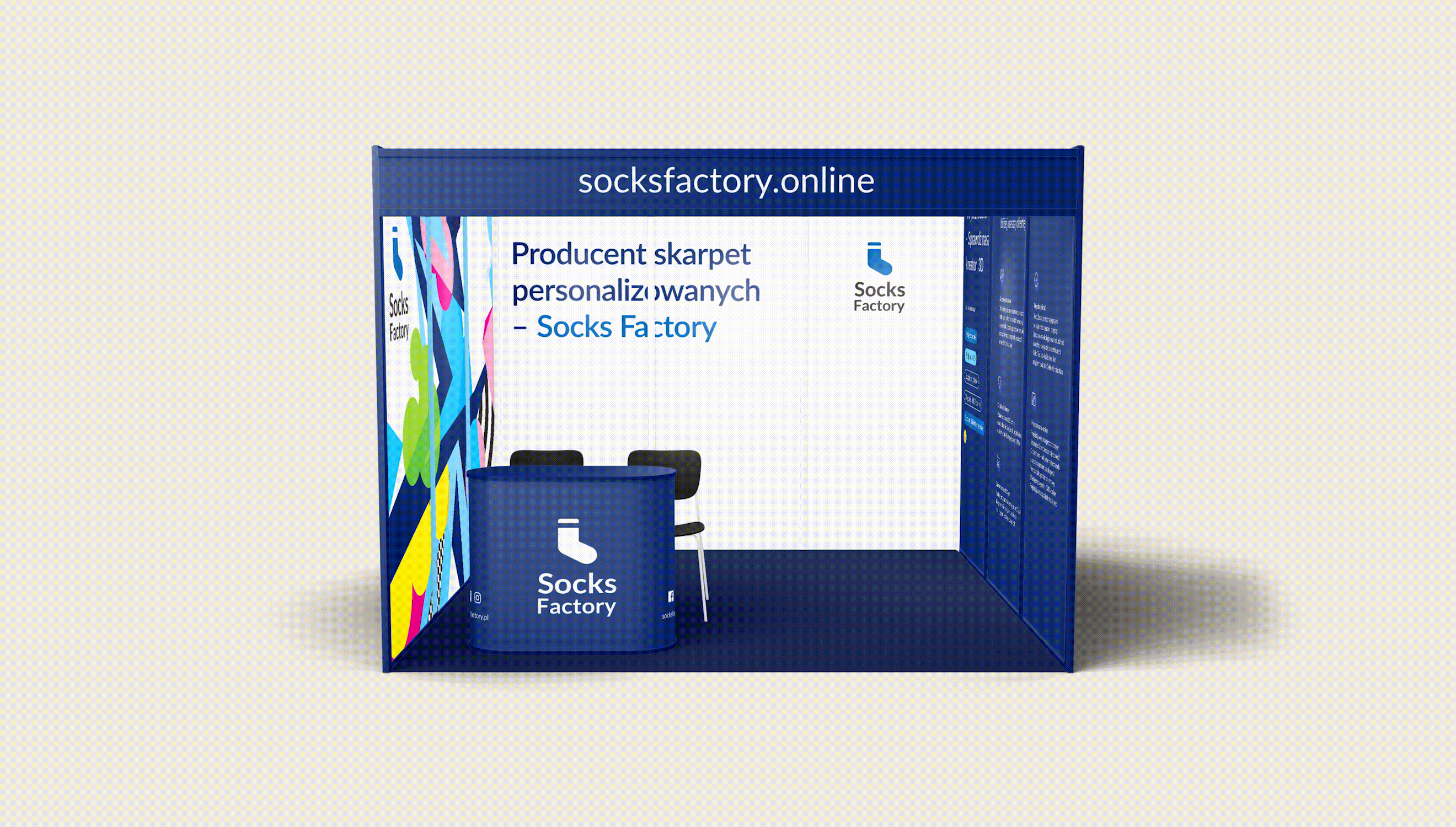
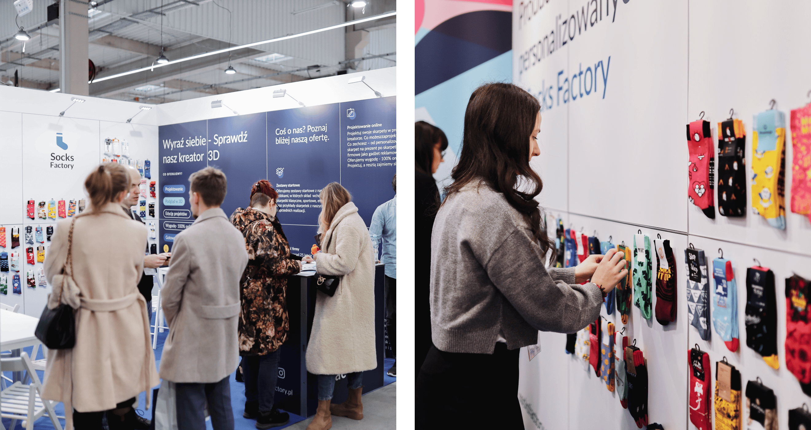
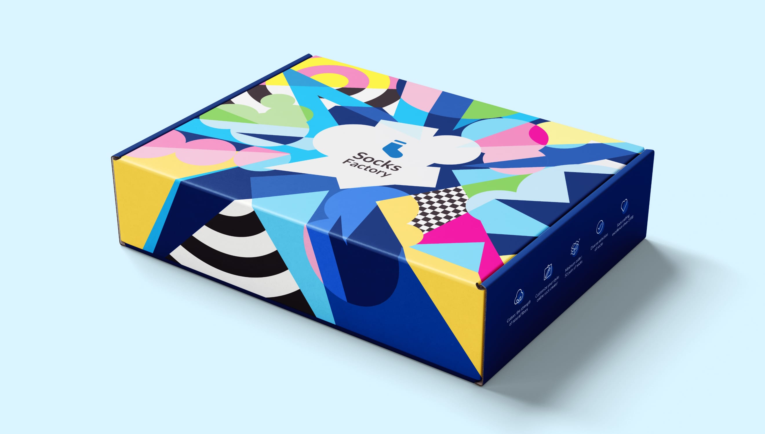
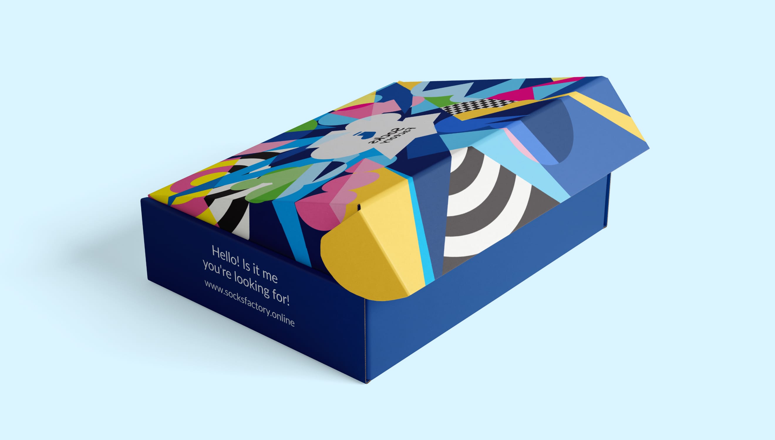
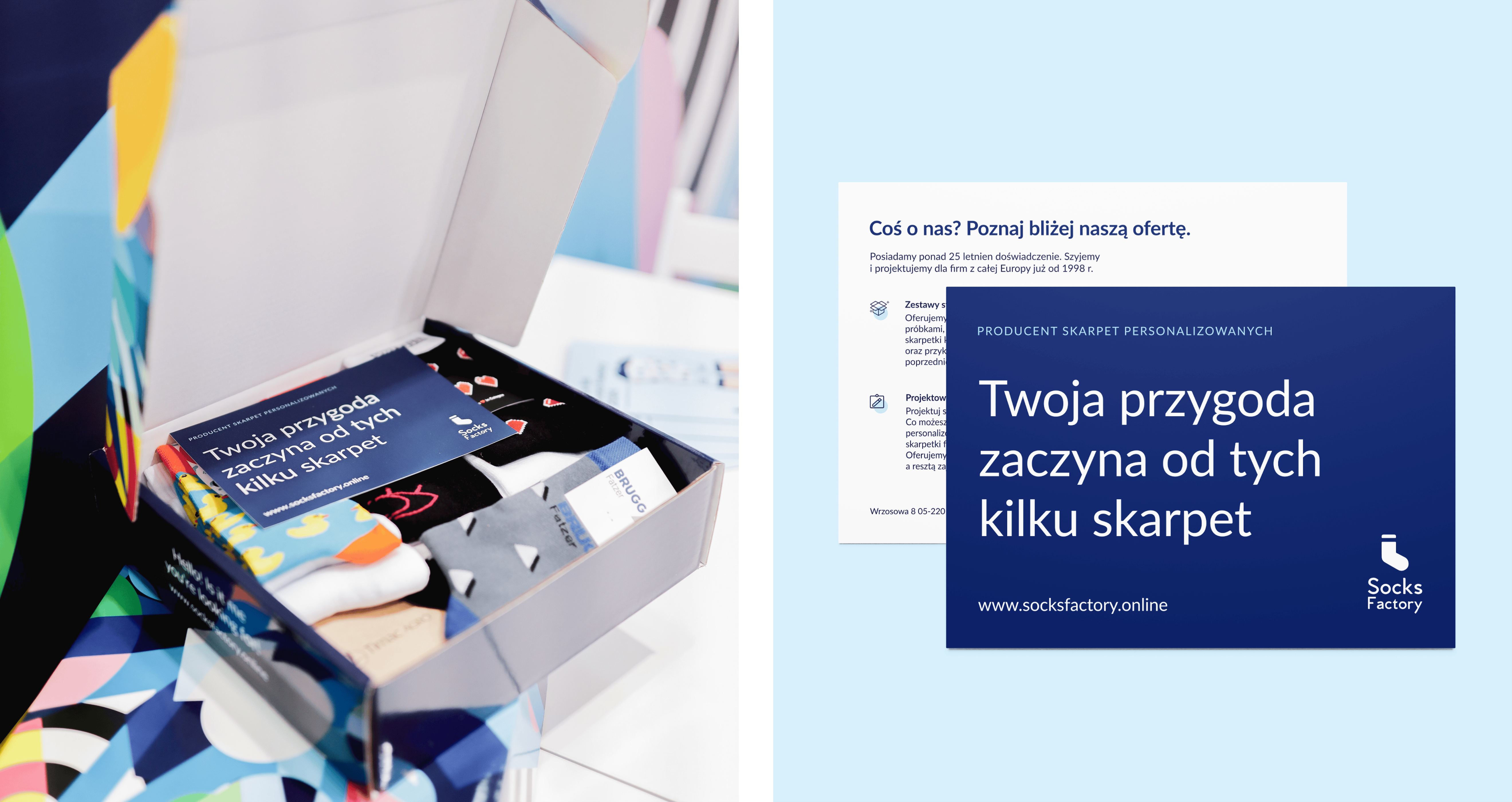
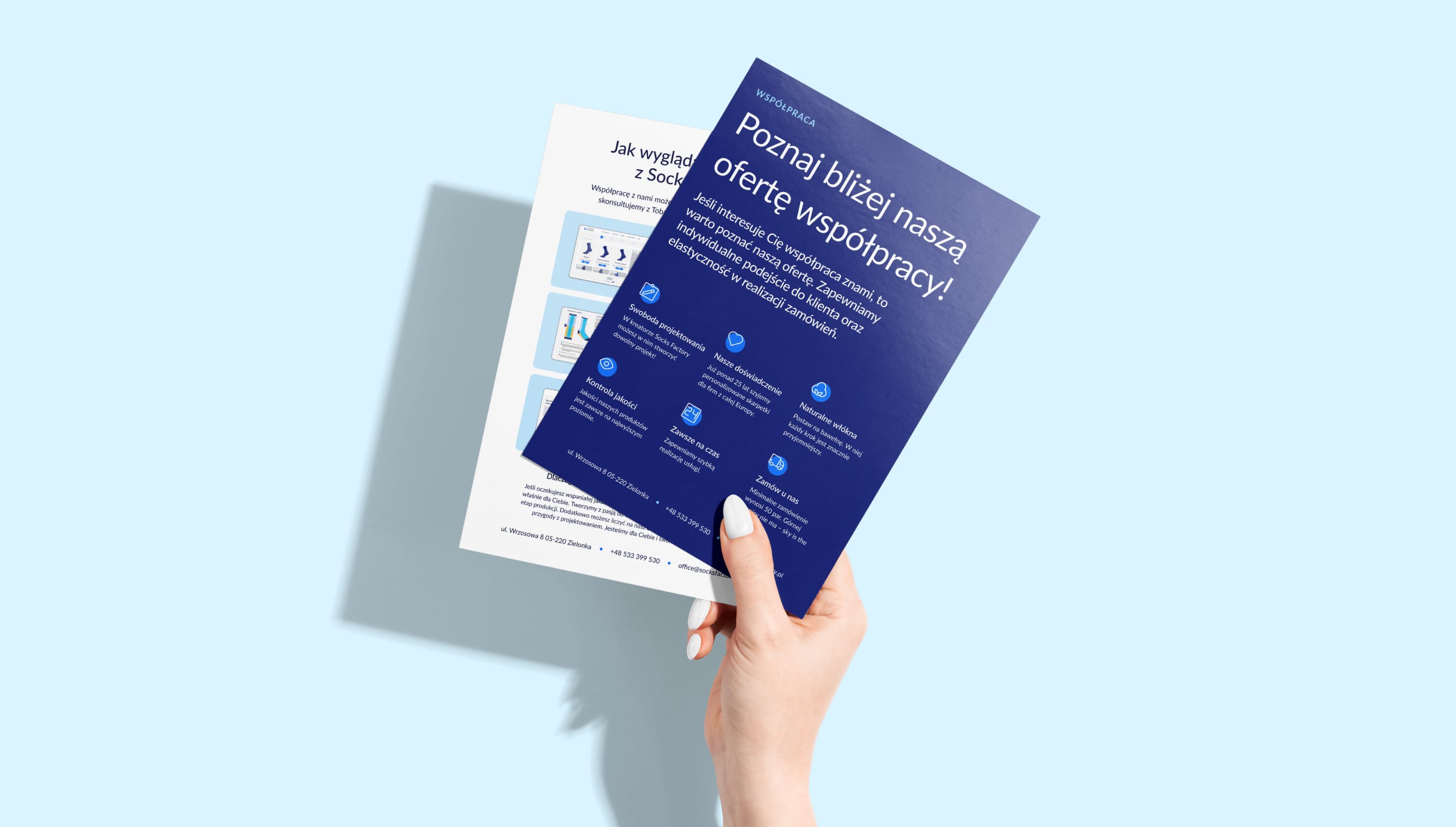
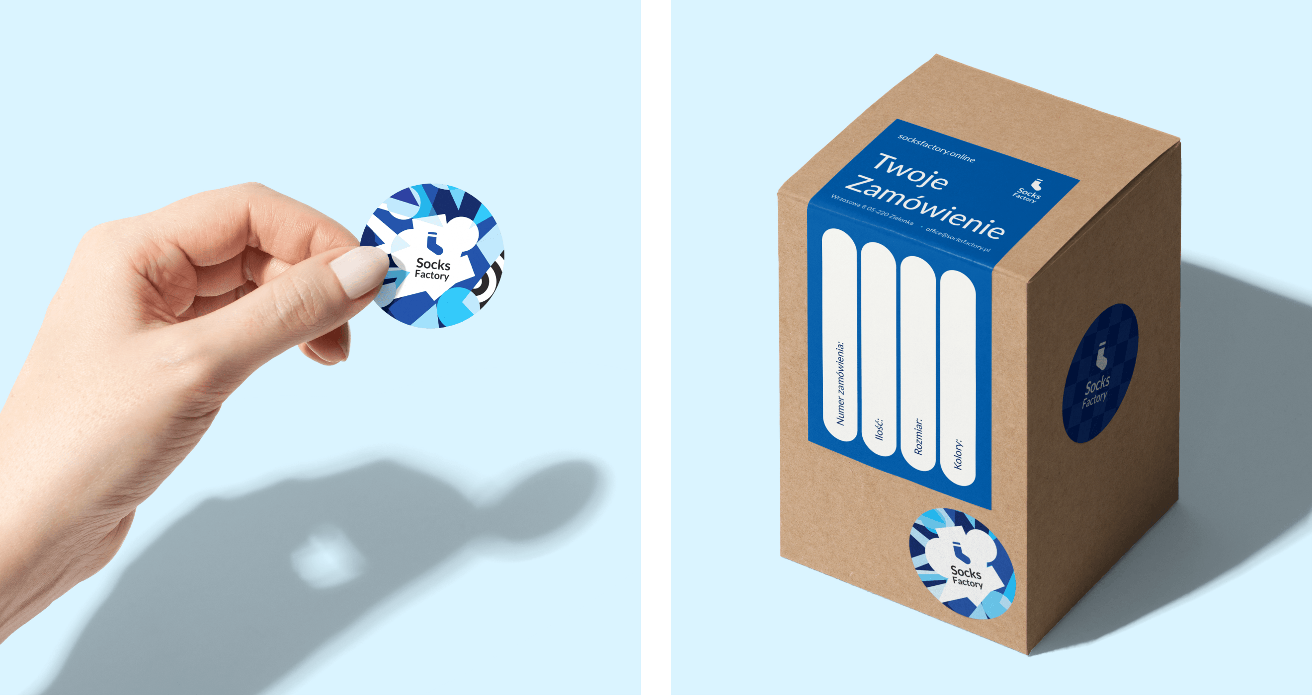
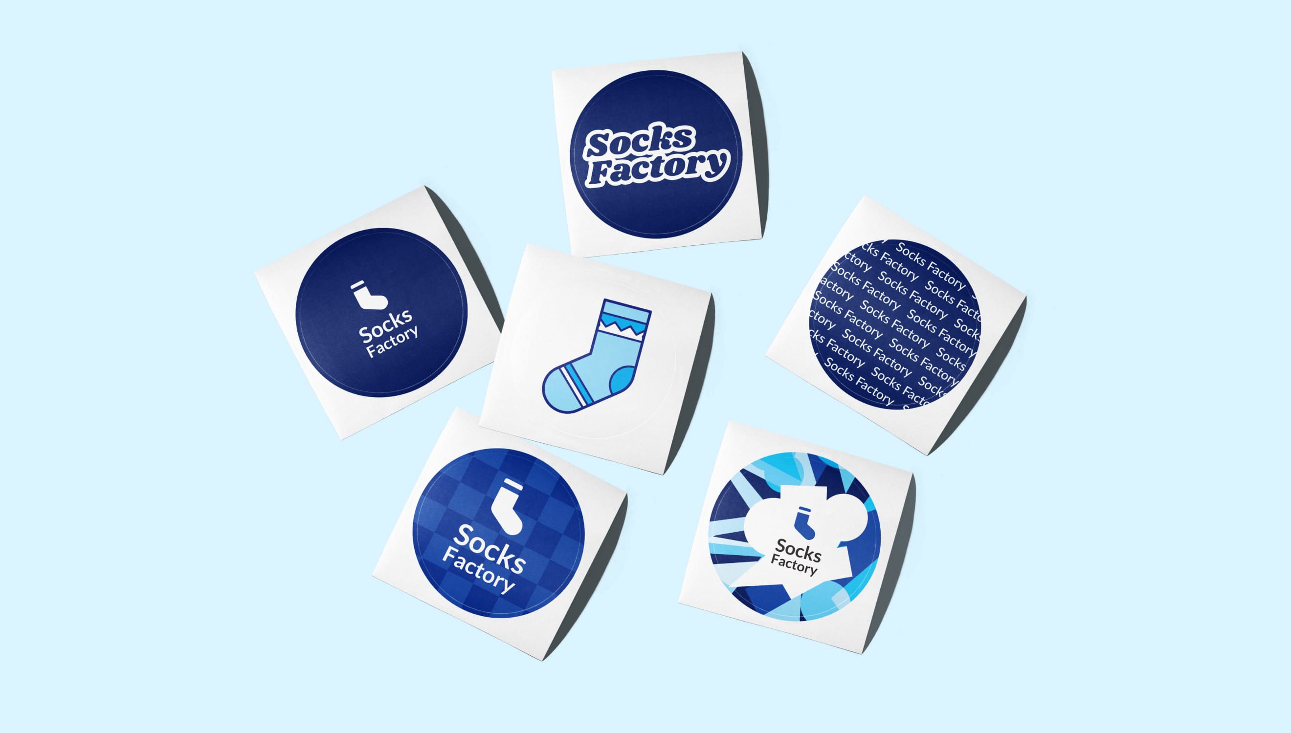
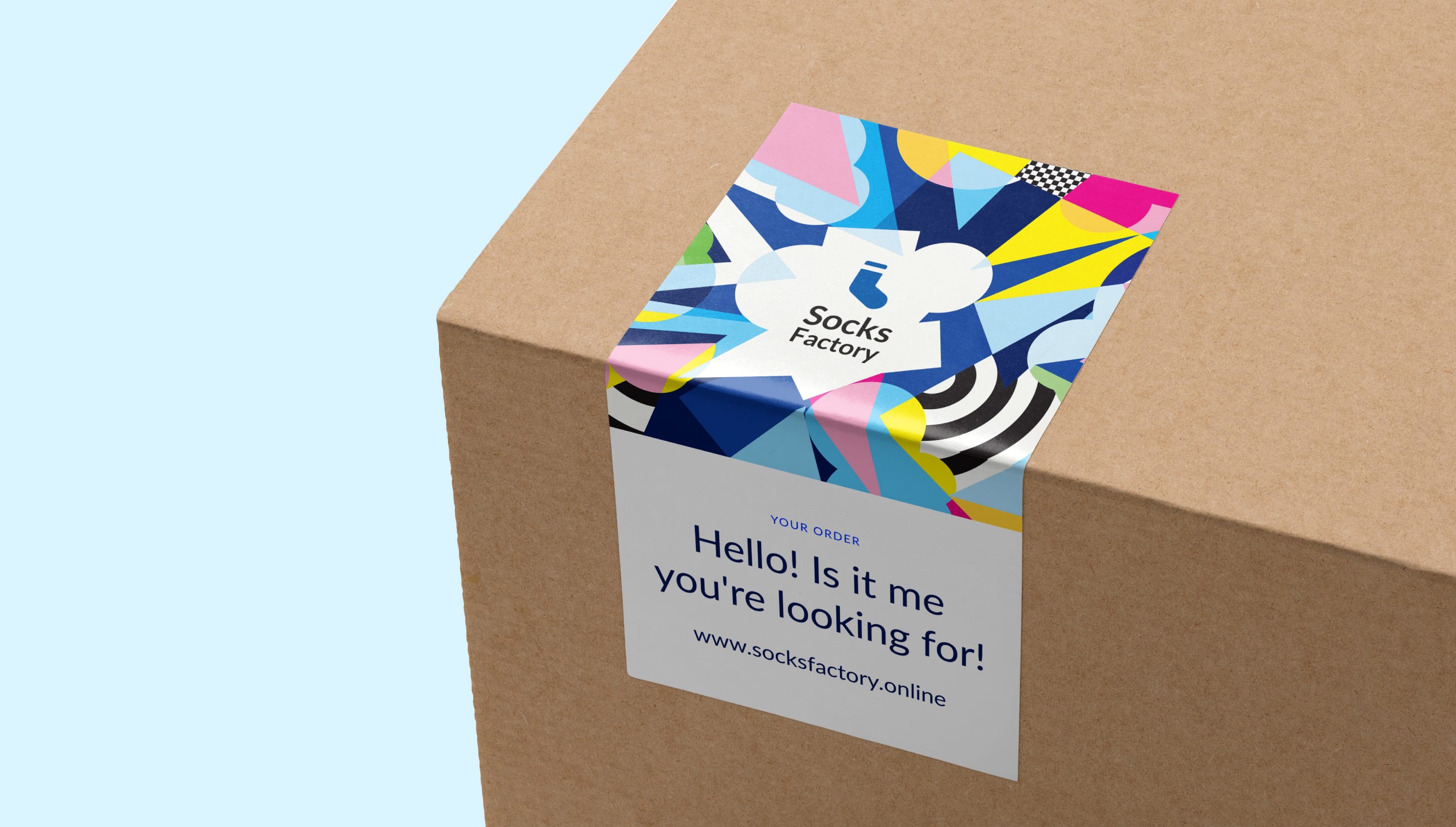
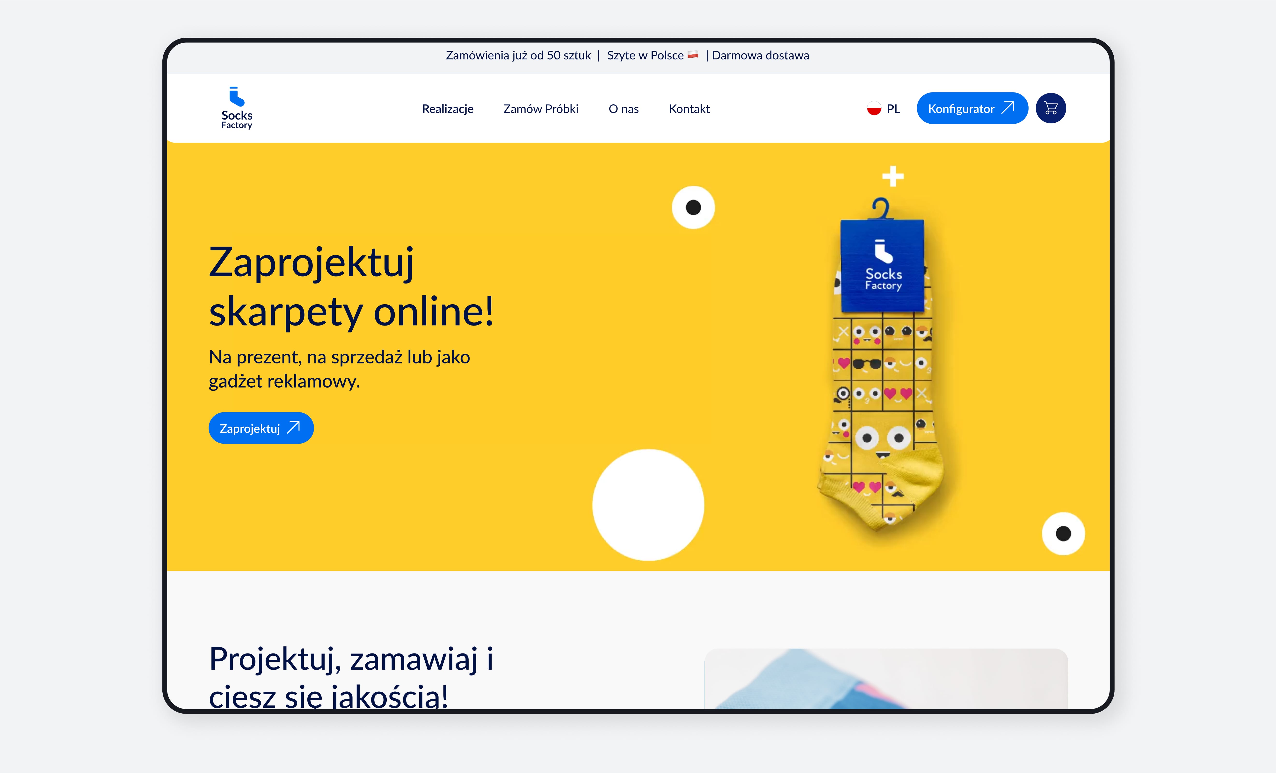
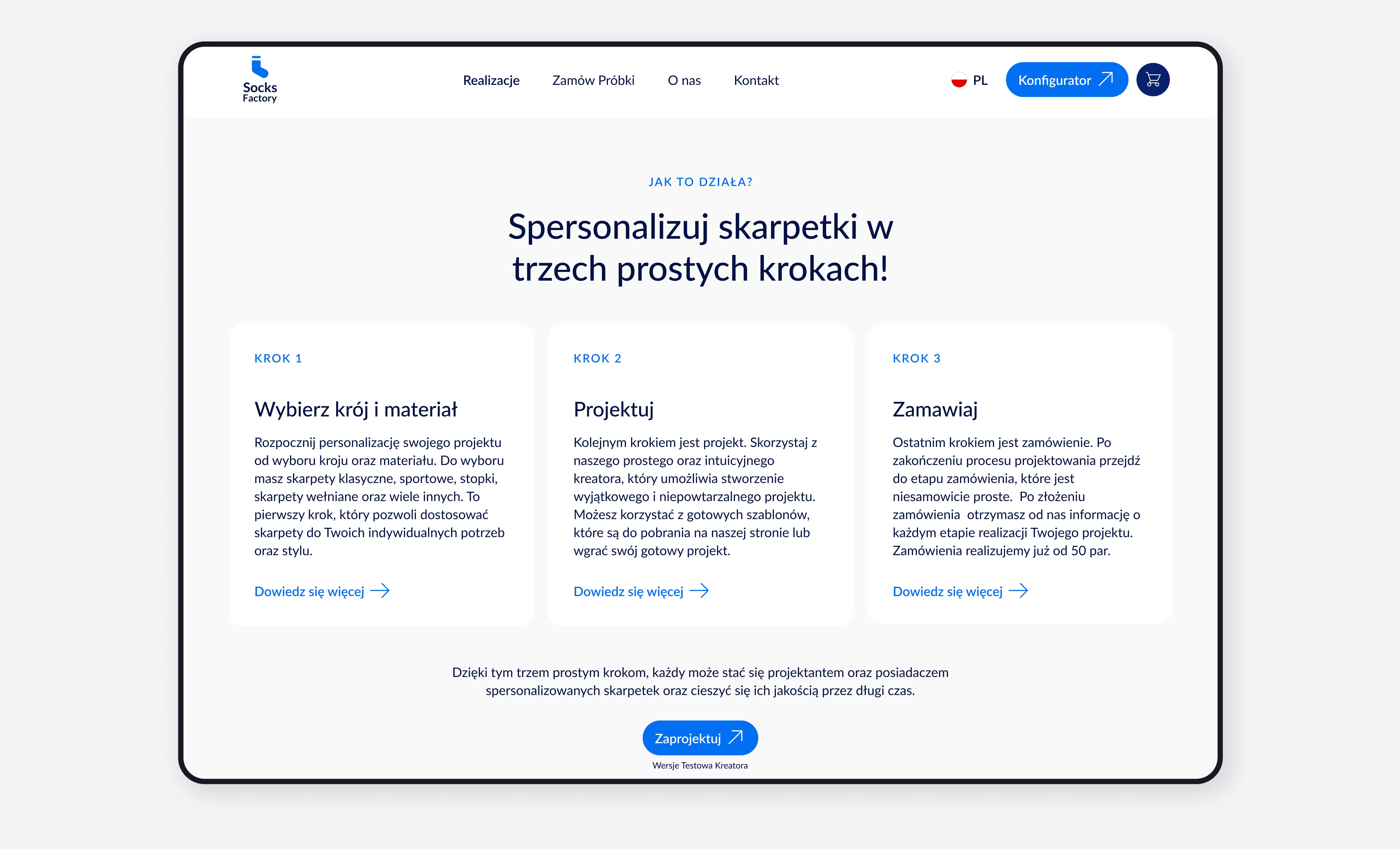
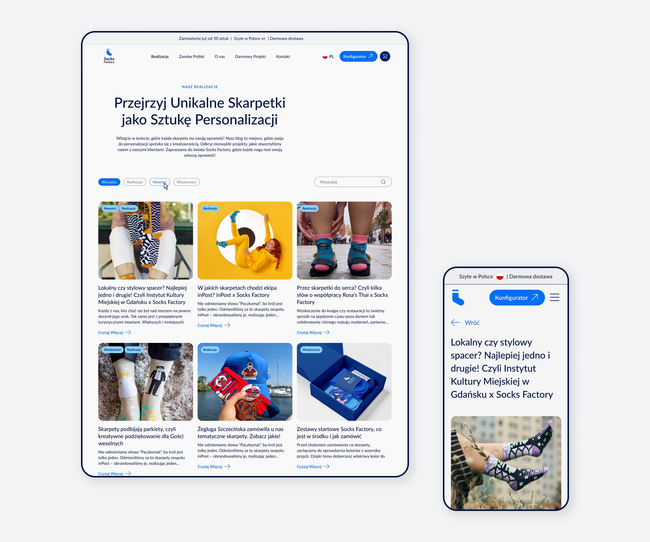
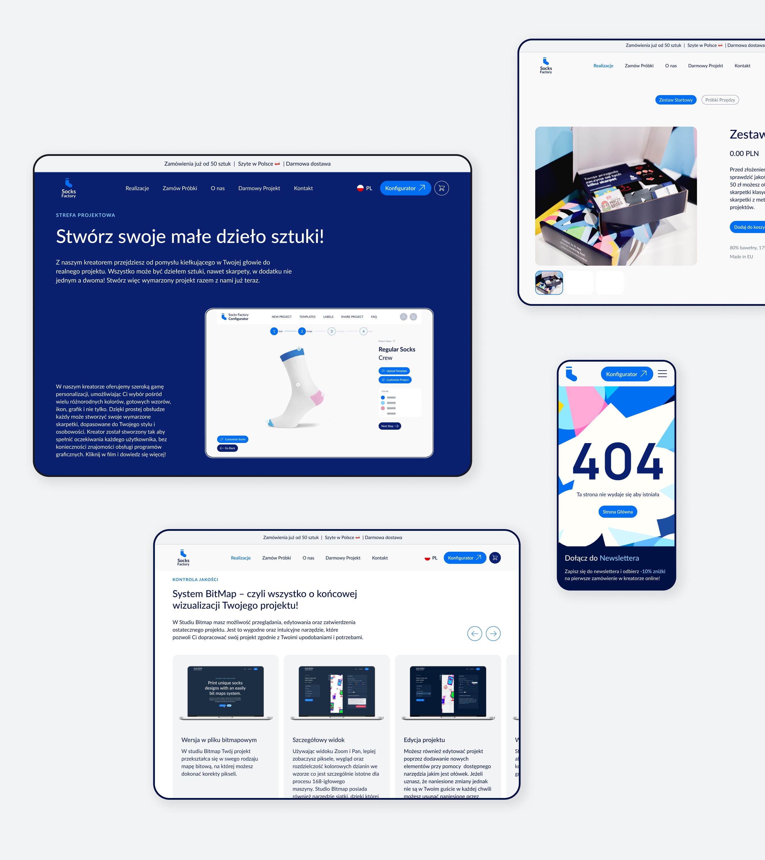
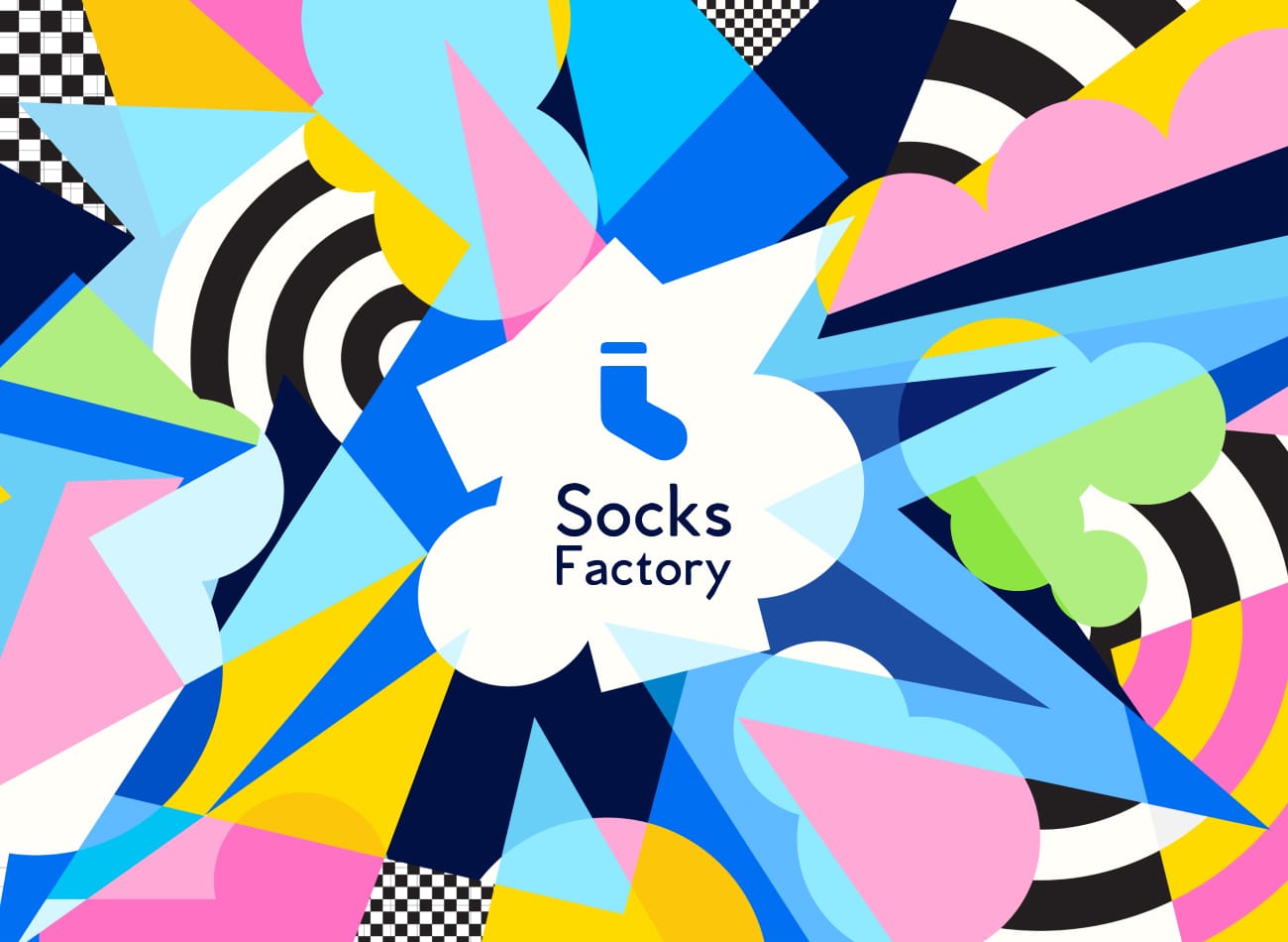
The primary goal was to develop a visual language that complements the existing logo while capturing the versatility and creativity involved in designing socks for various purposes. The branding strategy focuses on a colorful, inviting aesthetic, with a dominant blue palette that conveys approachability, trust, and professionalism. This choice aligns with the established identity while evoking reliability. To infuse a sense of dynamism, I introduced a geometric pattern that adds energy to all print materials, making them visually striking and memorable. Through strategic copywriting, the website engages visitors by highlighting key features and services in an informative and compelling way. In conclusion, the branding initiative for Socks Factory emphasizes creativity, quality, and customer engagement, blending existing elements with fresh design ideas.
Client
Industry
Years
Deliverables
Link


Credits
Quote
CEO, Socks Factory
Vibrant branding, where playful blue tones and dynamic geometric patterns create an inviting and memorable visual experience.