
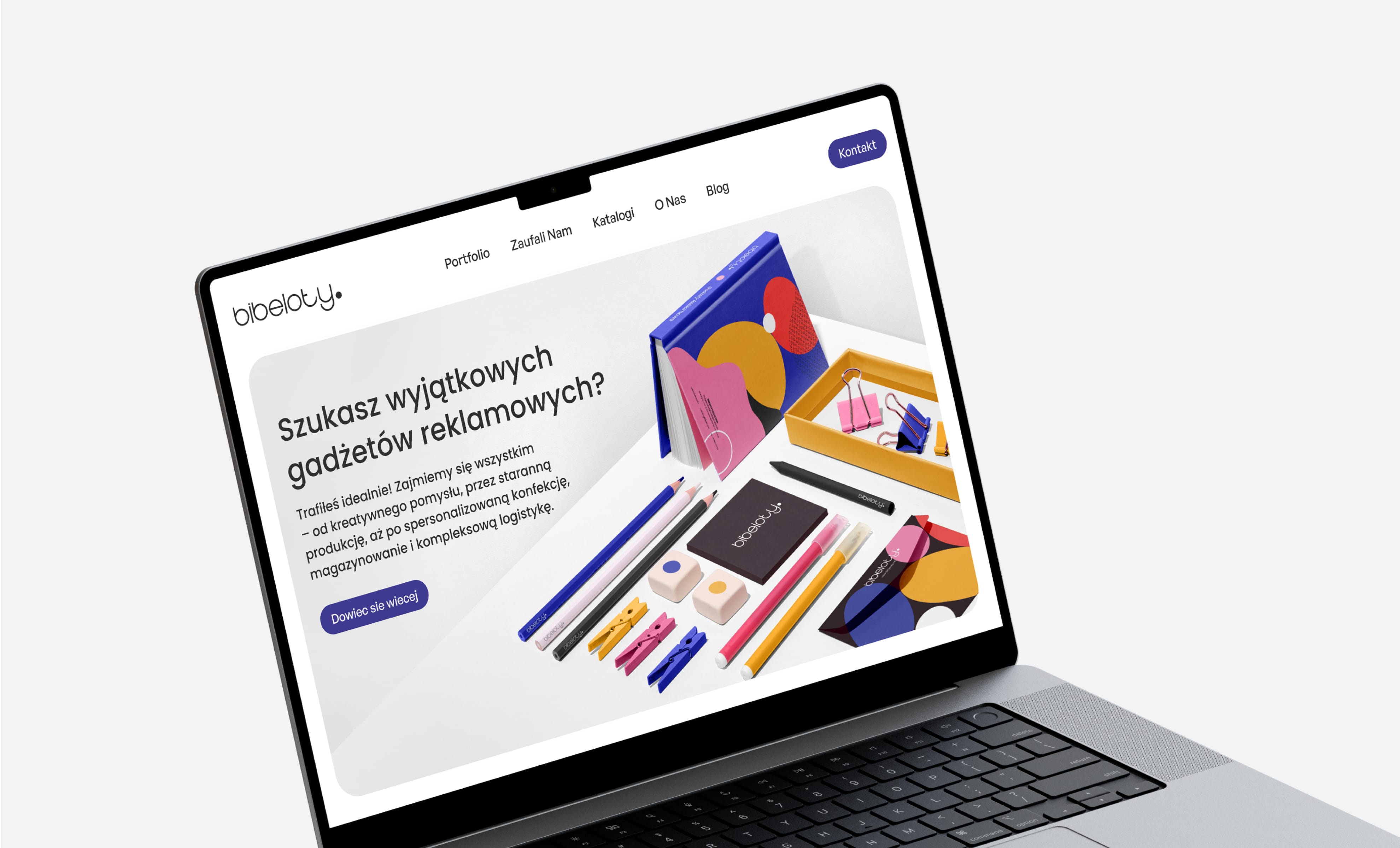
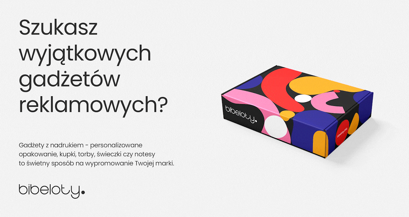
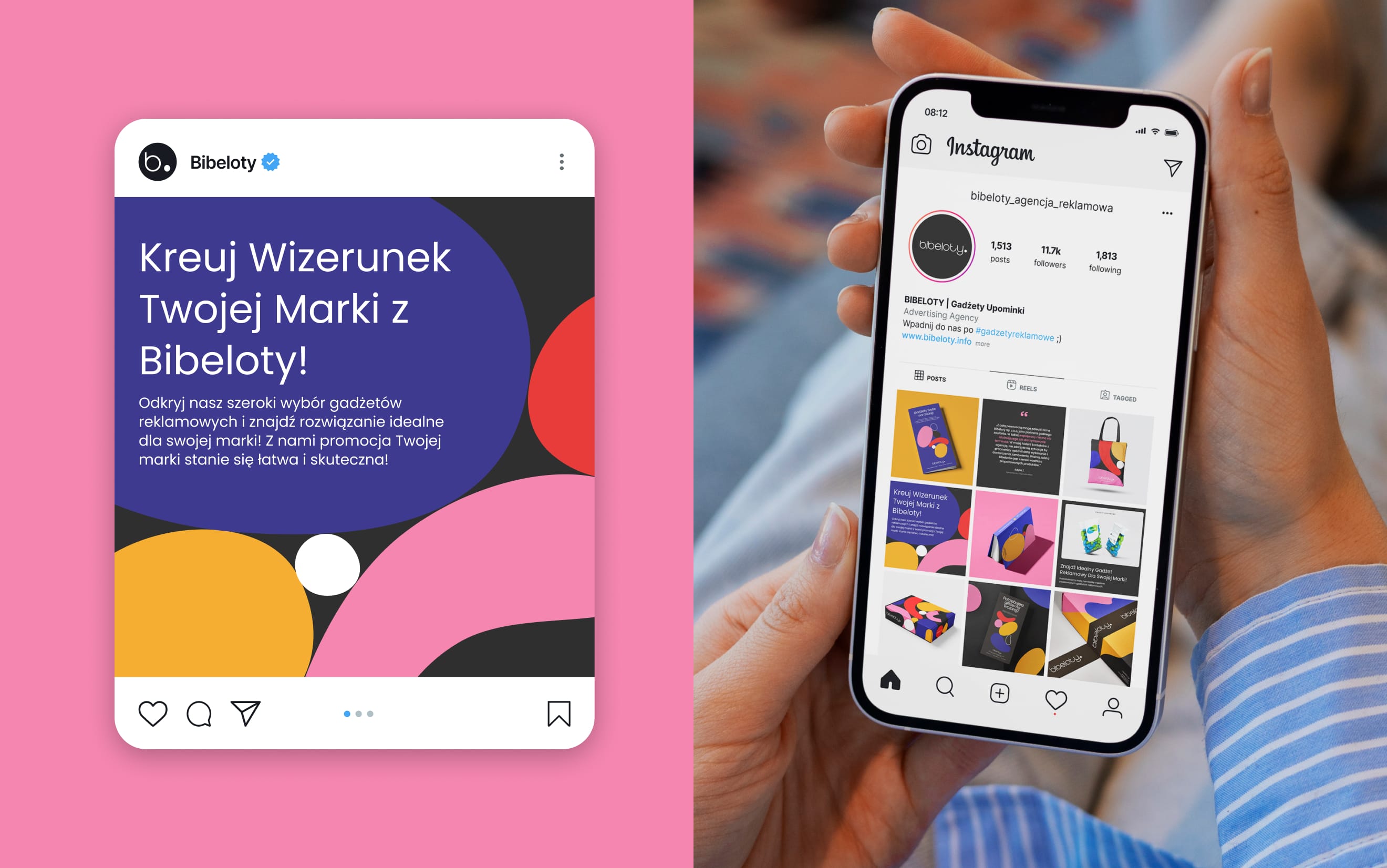
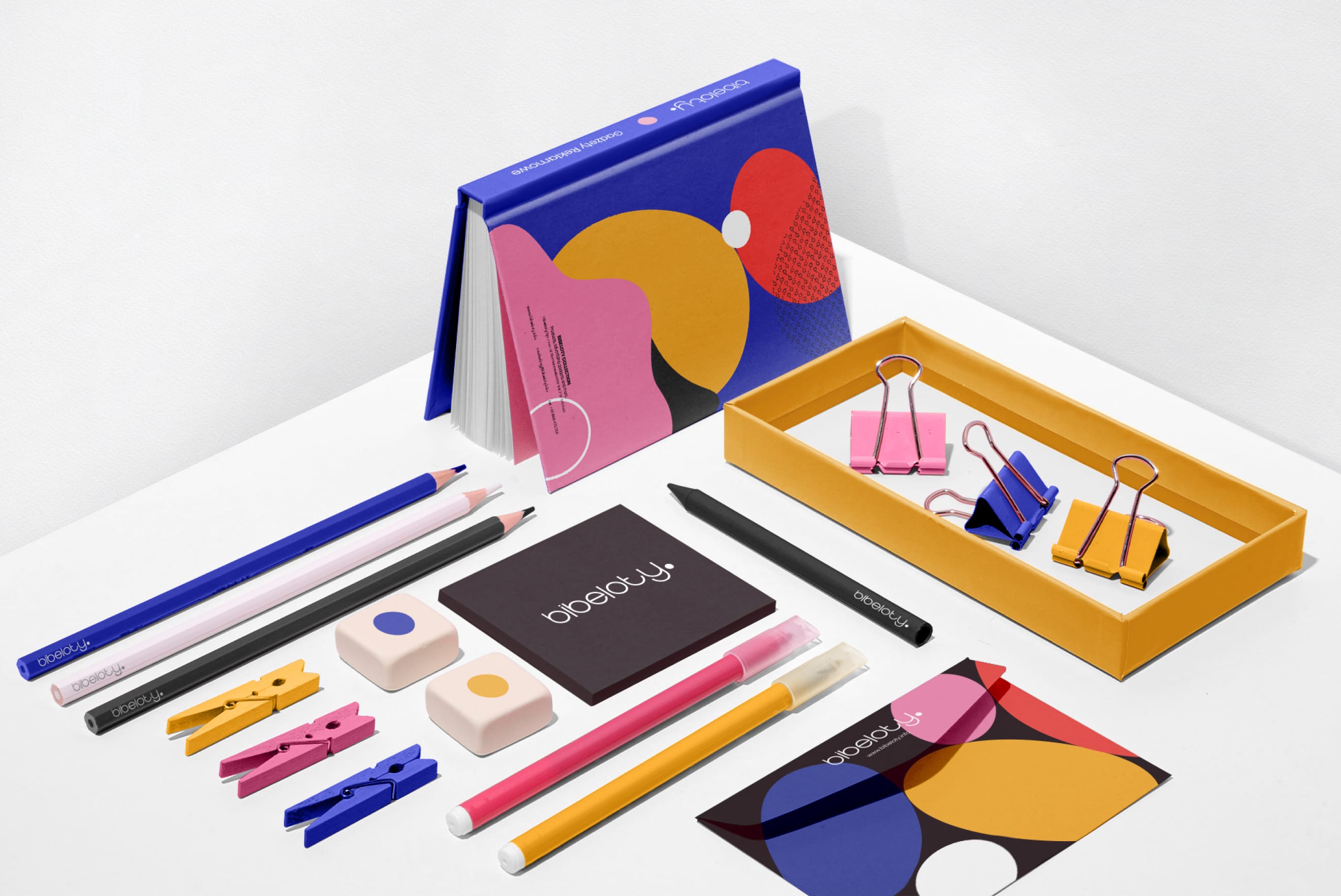
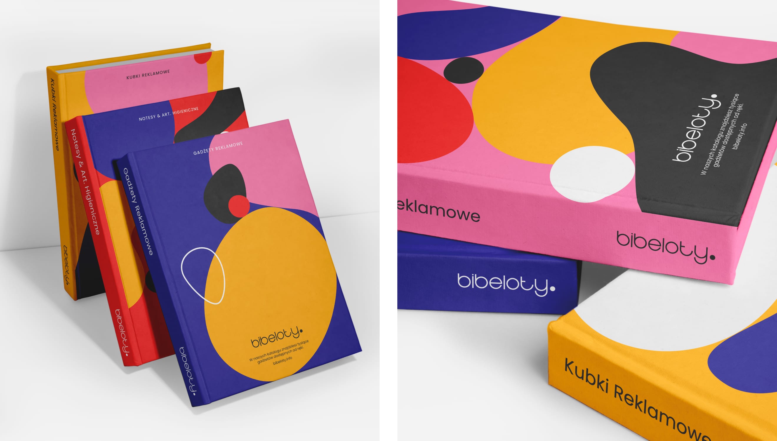
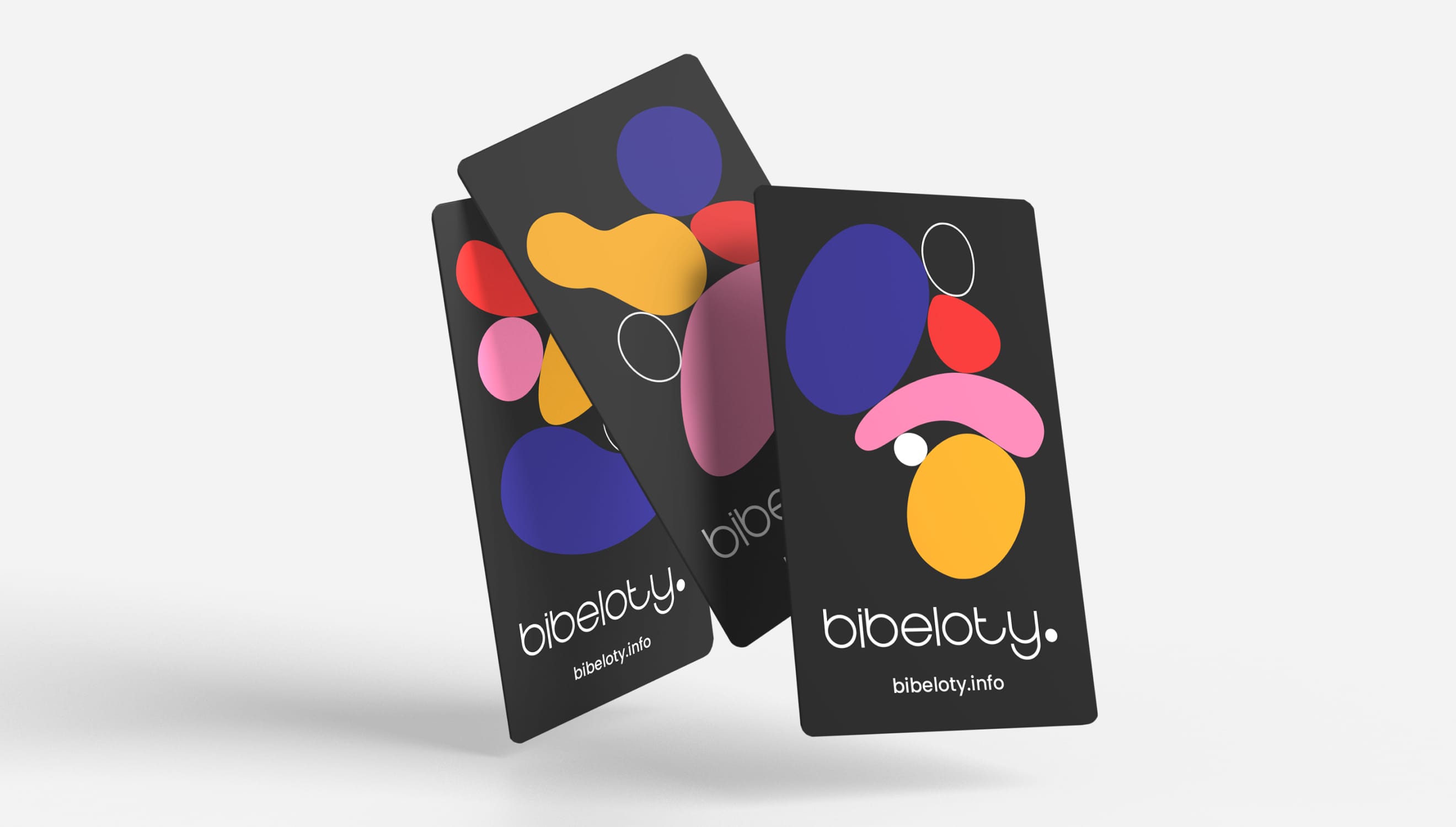
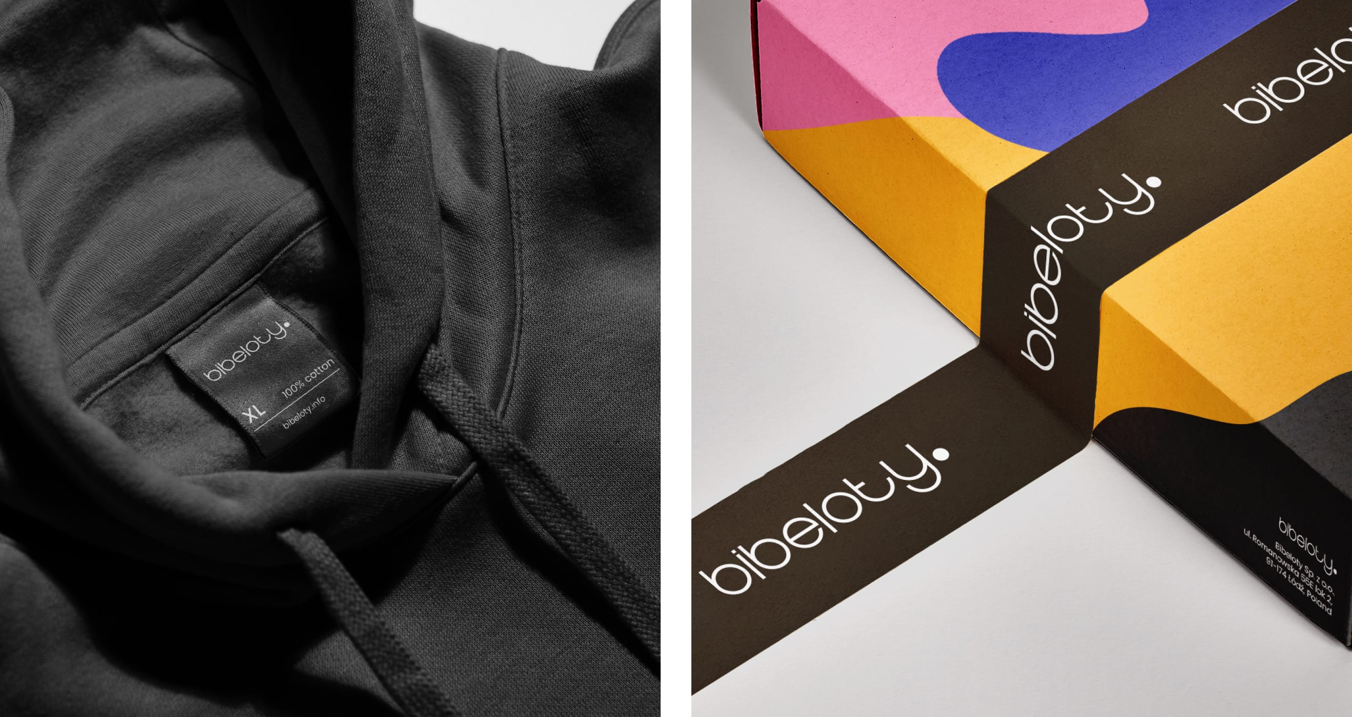
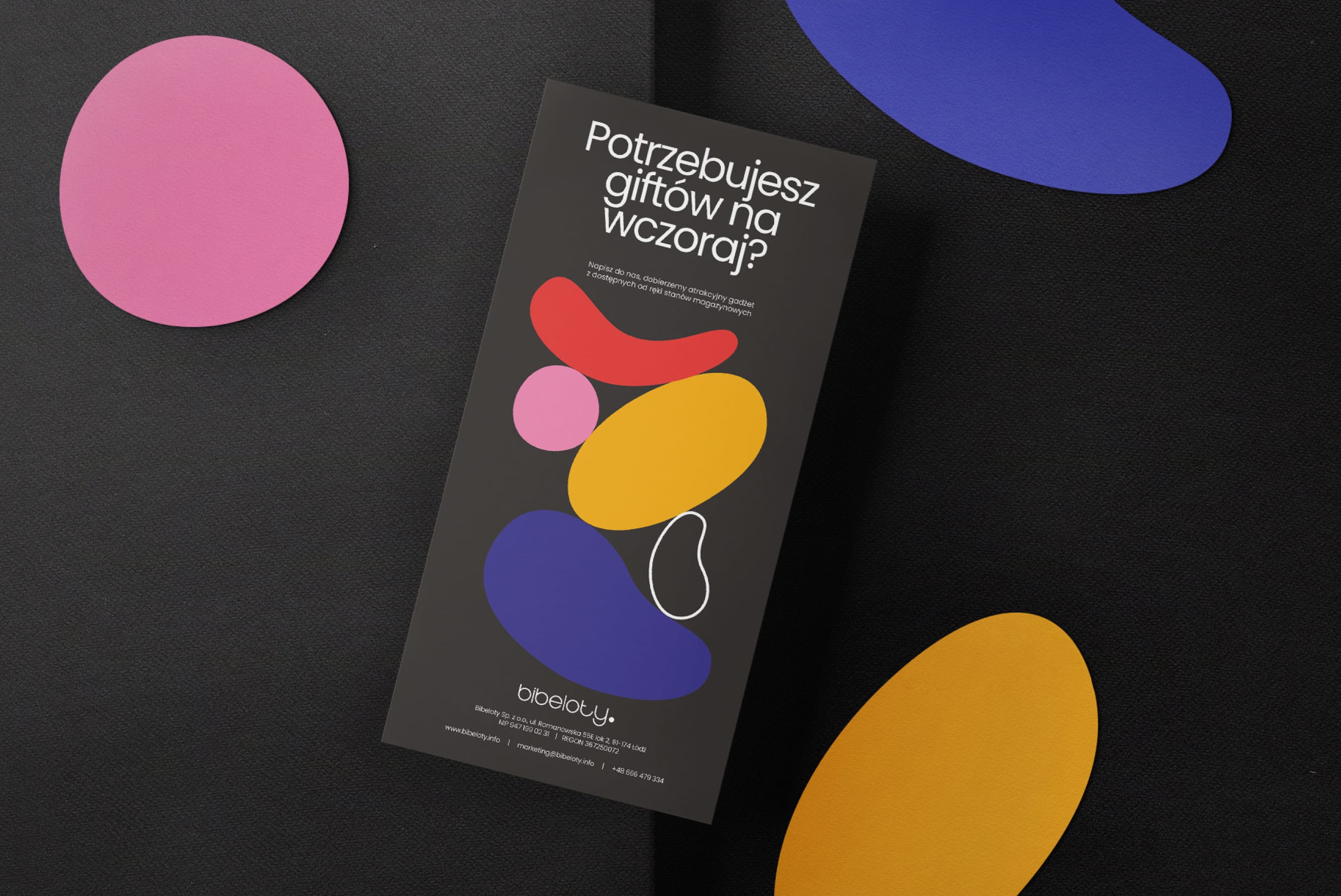
A Polish advertising agency specializing in gadget advertising and design faced the challenge of integrating their existing logo with a new brand identity focused on innovation and creativity. Retaining the black-and-white theme, I introduced contrasting colors and designed a set of versatile shapes, similar to Lego pieces. These shapes, representing the diverse aspects of Bibeloty, can be rotated, scaled, and recolored to create dynamic compositions. The four primary colors, along with monochromatic tones, balance intensity and ensure a visually striking design across various applications.
Client
Industry
Years
Deliverables
Link
Credits
Quote
Senior Account Manager
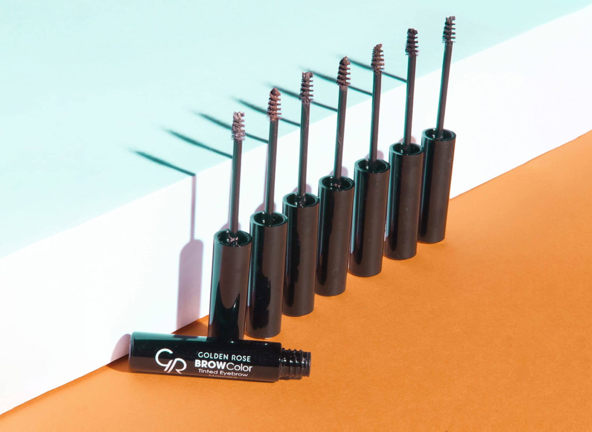
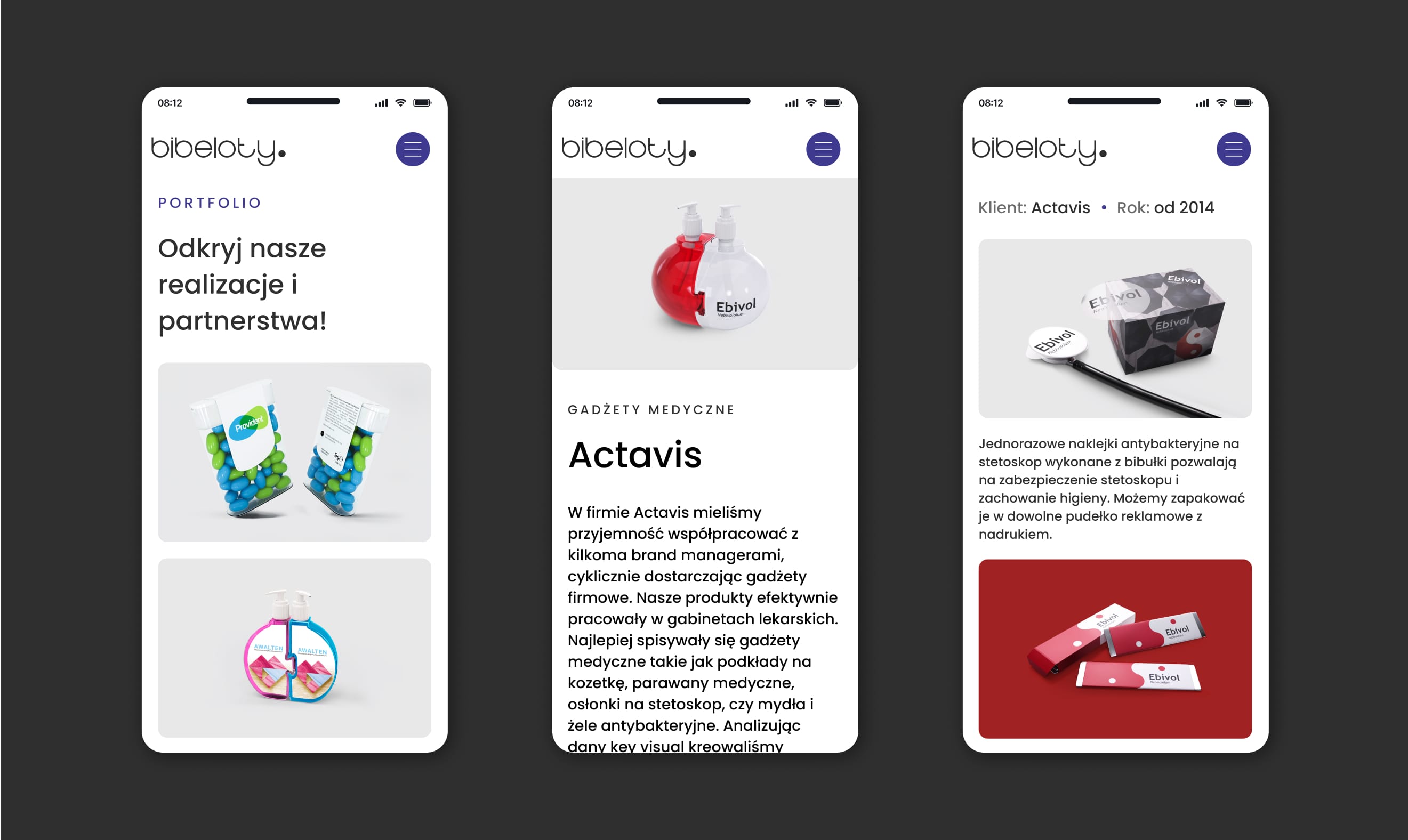
Capturing vibrant product photos that highlight the best of each season, ensuring your offerings shine brightly.
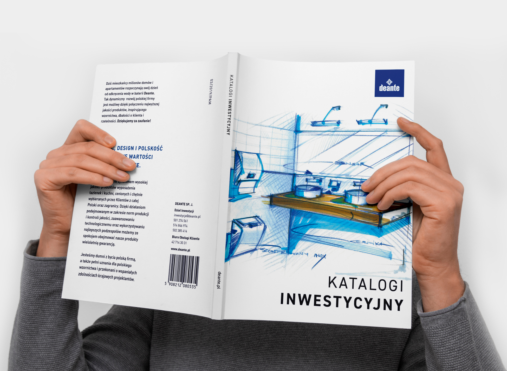
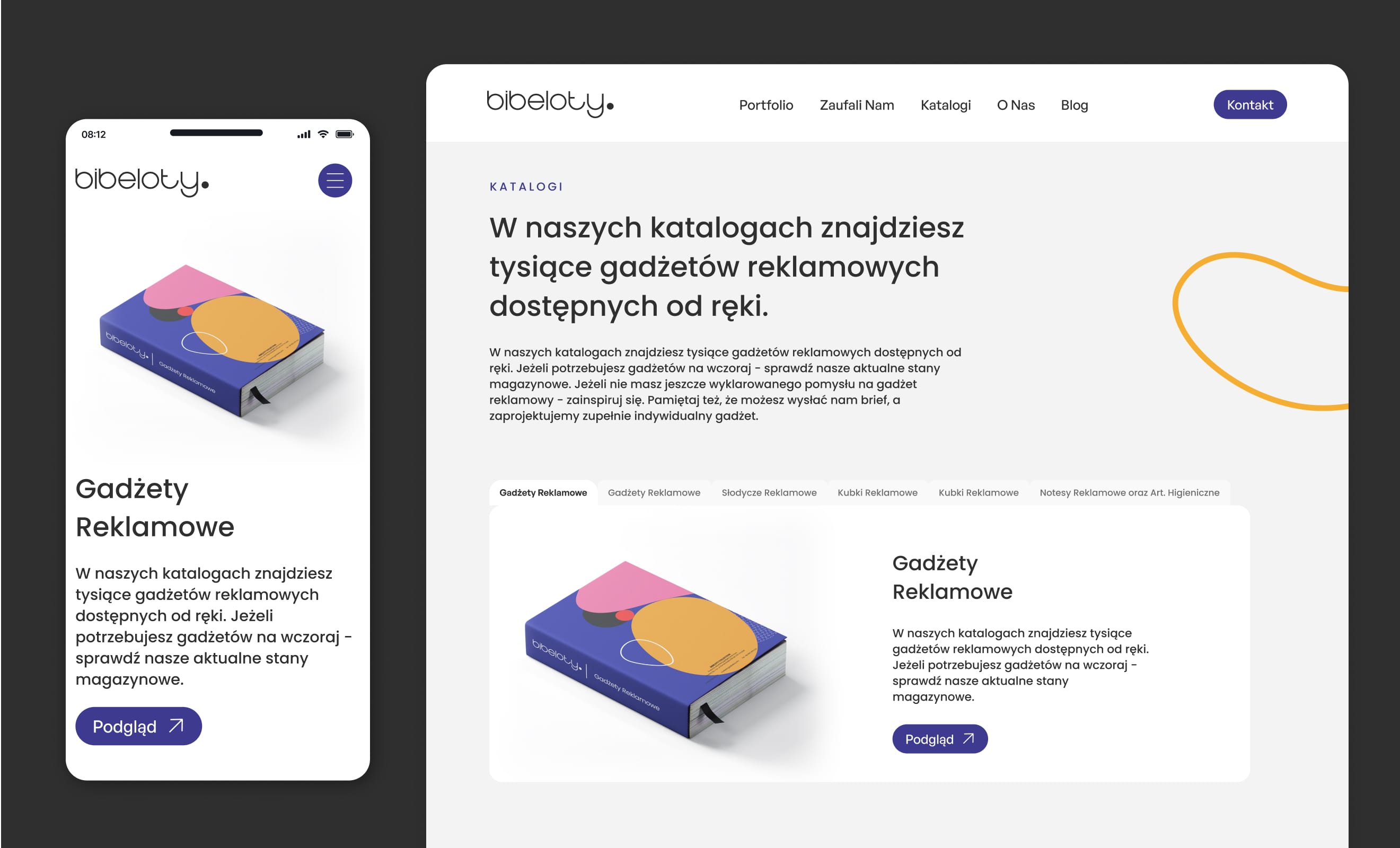
Tailored for a specific audience, this catalog presents all products with their key features and technical details.
